 http://www.packagingoftheworld.com/2016/03/trere-wine.html?m=1
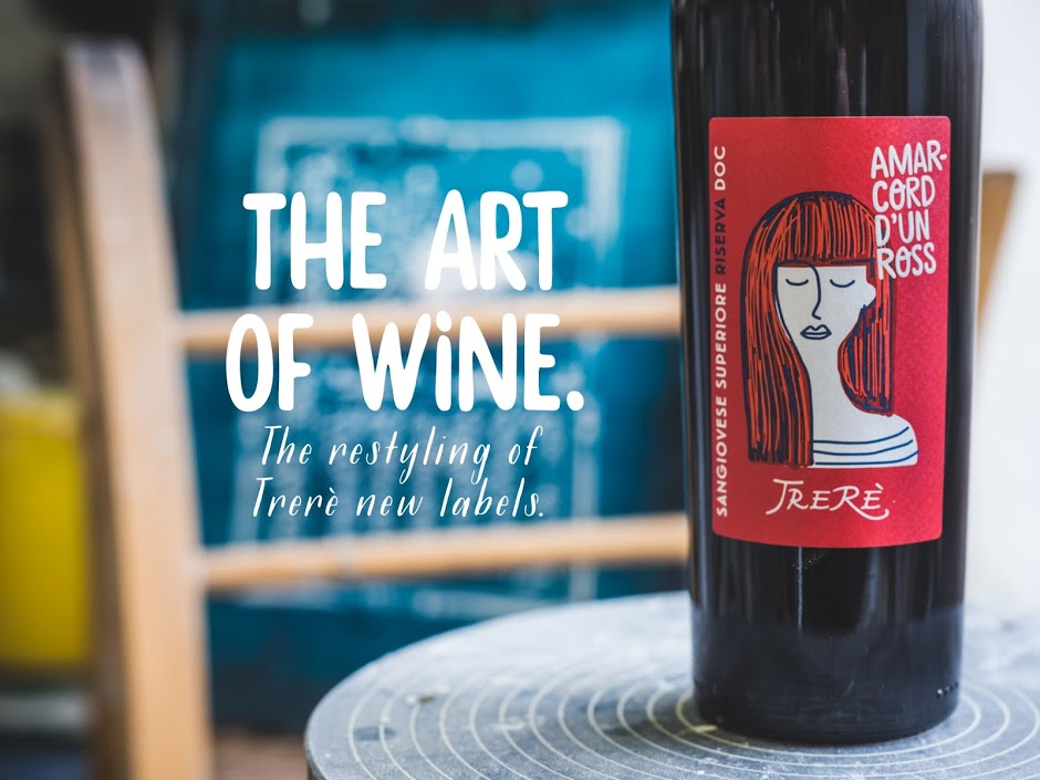
The art of wine. The restyling of Trerè new labels. The restyling of Trerè wine labels sees new names and faces. Colours and traits are well-defined, strong, iconic and immediate. The aim: to give a visual impact with the purpose of recognizing that the wine itself is the product of an art. An art coming from the earth and passing through the wise and passionate hands of those who produce this wine: a family from Faenza who for three generations have pursued the aim of excellence in production. Hence the choice of a distinctive and recognizable style, which immediately speaks of art, and therefore about the art of wine. To do this effectively, and lead to identification, tradition is illustrated by evidence of simplicity: the roots remain but the codes change, through a restyling aimed at enhancing the passion and the taste of pleasure, while talking about a creative side also aimed towards young people and newcomers. The new labels have the names of Romagna that echo an established tradition, resounding in a visual context where the unexpected immediacy of the trait increases its recognition and character. This leads to the benefit of a stronger and more distinctive visible impact. The sincere note is the most authentic way to tell of a passion that becomes art. – See more at: http://www.packagingoftheworld.com/2016/03/trere-wine.html?m=1#sthash.YtS3X1n8.dpuf
Coloratissimo come le nostre etichette è bellissimo il Cavatappi Parrot: eccoti il link per acquistarlo scontato su AMAZON!

A di Alessi – Parrot – Proust Cavatappi sommelier in alluminio pressofuso e PC. Decorato a mano, “Proust”. Licensed by Pulltaps.
